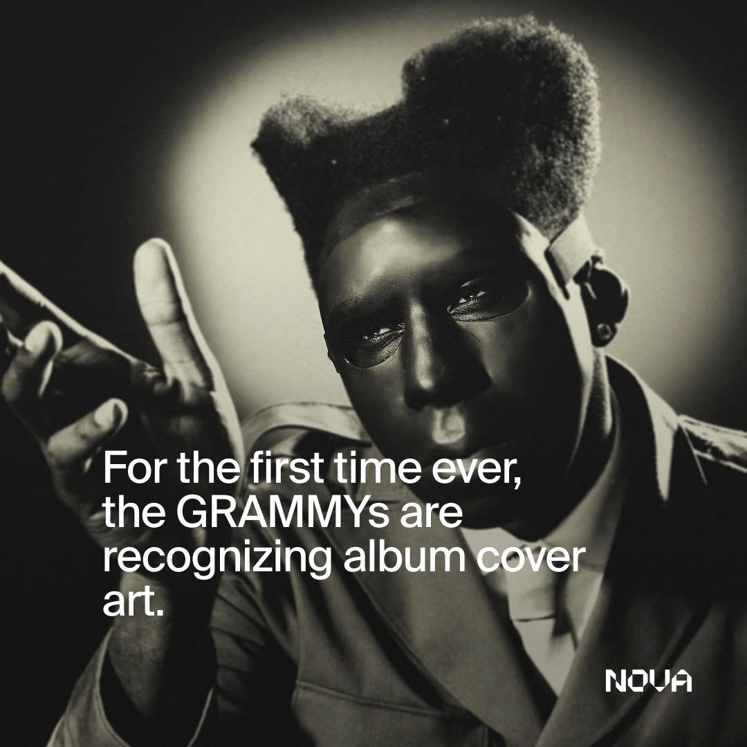
For the first time ever, the GRAMMYs are officially recognizing album cover art.
It’s a long-overdue step forward for creative recognition in the music industry. Album covers shape how music is perceived before it’s ever heard — they build identity, signal tone, and often become cultural artifacts in their own right. For decades, photographers and art directors have played a central role in how albums are marketed, remembered, and consumed.
Behind every nominated cover is a team of creatives shaping the visual language of an artist’s world. With the introduction of Best Album Cover, the GRAMMYs are finally acknowledging the photographers and art directors whose work helps sell records, define eras, and influence culture.
We wanted to give flowers to both the art directors recognized by the Academy and the photographers whose images bring these covers to life.
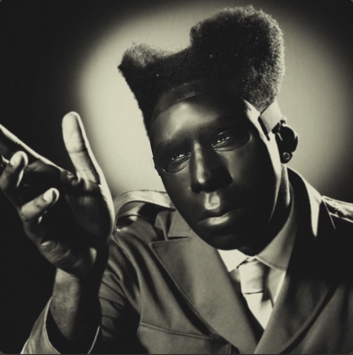
Winner: CHROMAKOPIA - Tyler, The Creator
Album Cover Art & Visual Direction
CHROMAKOPIA stood out for its bold visual identity and intentional collaboration between photography and art direction. The cover doesn’t just support the music — it introduces the world Tyler, The Creator is building before a single track plays.
Photographed by Luis “Panch” Perez and art directed by Shaun Llewellyn alongside Perez himself, the image balances graphic clarity with cultural weight. It’s a reminder that album covers are not secondary assets, but core creative statements that shape how music is received, remembered, and shared.
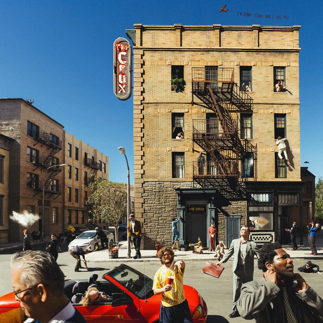
The Crux - Djo
Art Direction by William Wesley II
Shot by Neil Krug, The Crux leans into a cinematic, atmospheric visual language that mirrors the album’s tone. The collaboration between photography and art direction creates a cohesive world that feels intentional, textured, and emotionally aligned with the music.
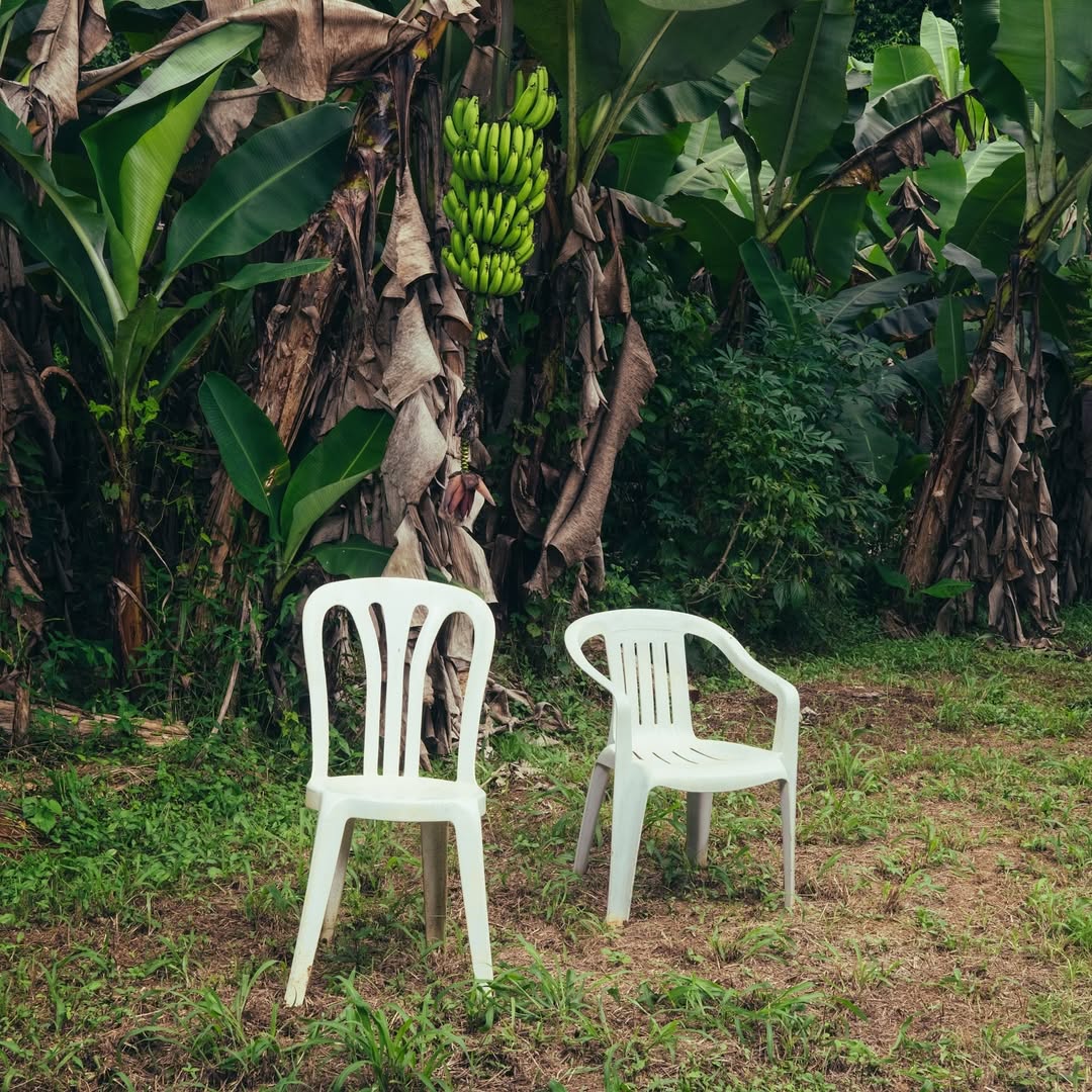
Debí Tirar Más Fotos - Bad Bunny
Art Direction by Benito Antonio Martínez Ocasio
With Bad Bunny directly involved in the art direction, Debí Tirar Más Fotos feels deeply personal and diaristic. The cover leans into authorship and intimacy, reinforcing the idea that visual identity is an extension of the artist’s voice — not a separate layer added after the music is finished.
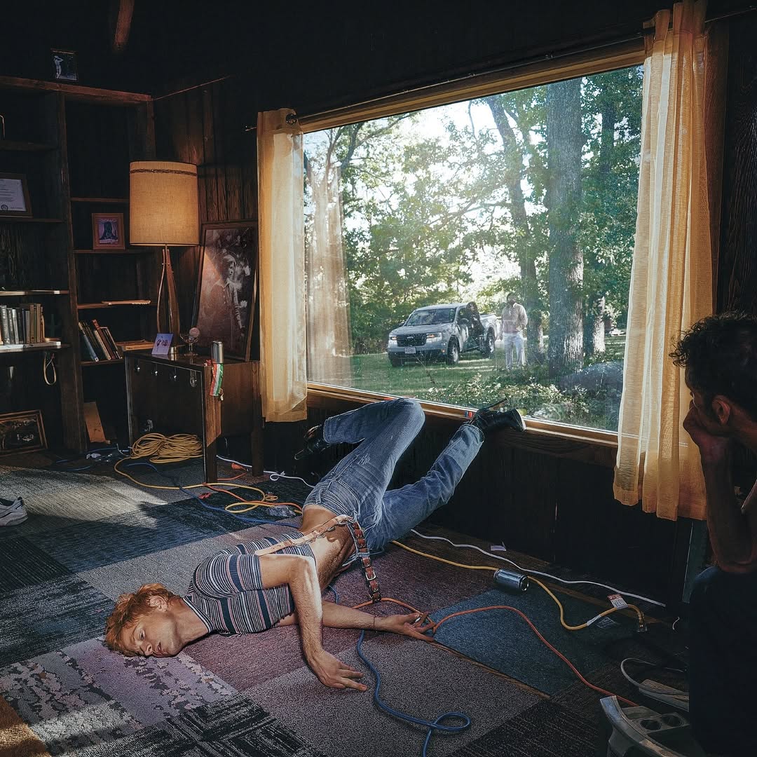
Glory - Perfume Genius
Art Direction by Cody Critcheloe & Andrew J.S.
Glory channels intimacy and vulnerability through restraint. The cover leans into softness and emotional tension, using minimalism to mirror the album’s introspective tone. Rather than demanding attention, the image invites it — creating a quiet but powerful visual language that aligns closely with Perfume Genius’ world. It’s a reminder that album cover art doesn’t need spectacle to leave a lasting impression; clarity, mood, and intention can speak just as loudly.
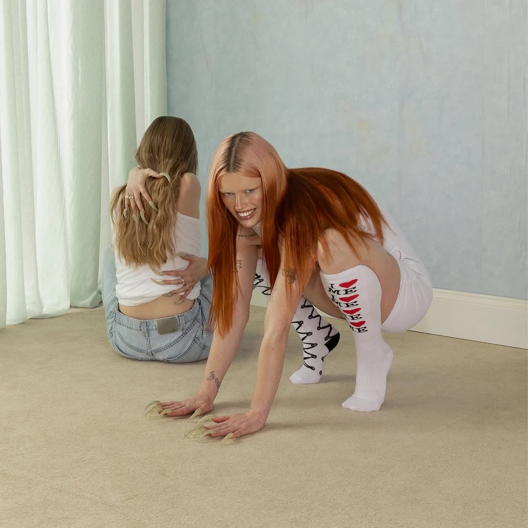
moisturizer - Wet Leg
Art Direction by Hester Chambers, Ellis Durand, Henry Holmes, Matt de Jong, Jamie-James Medina, Joshua Mobaraki & Rhian Teasdale
moisturizer embraces a collaborative, maximalist approach to visual identity. With a wide creative team shaping the art direction, the cover reflects Wet Leg’s irreverent energy and playful tone, proving that strong visual worlds can emerge from collective authorship without losing clarity or impact.
The introduction of Best Album Cover marks a meaningful shift in how the music industry values visual creators. Album covers are often the first point of contact between an artist and a listener- and finally, the photographers and art directors shaping those moments are getting the recognition they deserve.